saturation is how strong a color feels. vivid is strong and pure. muted is soft and grayish. we wanted to know if stronger color helps an icon rate higher.
what we checked
we split all 15,864 icons into three groups.
- vivid 6,202 icons, 39 percent
- normal 5,681 icons, 36 percent
- muted 3,981 icons, 25 percent
then we took the average weighted rating for each group.

vivid is first at 4.28. muted is next at 4.26. normal is last at 4.25. the gap is small but clear. a bit more punch helps.
what about colorfulness
colorfulness is different. it counts how many distinct hues an icon has. high means many hues, low means one or two.
- high 7,238 icons
- medium 4,941 icons
- low 3,685 icons
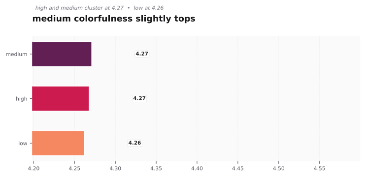
medium is top at 4.27. high is close at 4.26. low is also 4.26. you do not need a rainbow. one or two strong hues with good contrast is enough.
the bigger picture on popularity
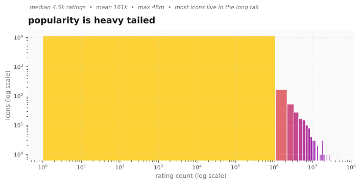
most icons live in the long tail. the median is 4.5k ratings, the mean is 161k, the max is 48m. only a few apps have huge counts. this is why weighted rating matters. it keeps the average fair.
what this means for you
- if your icon feels flat, raise saturation a little before you add new colors.
- keep colorfulness focused. a dominant color plus one or two supports rates better than many hues.
- test on light and dark backgrounds. vivid keeps contrast. muted can disappear on light gray.