brightness is how light a color feels. we measured it for every icon and put each icon in a bucket.
what we found
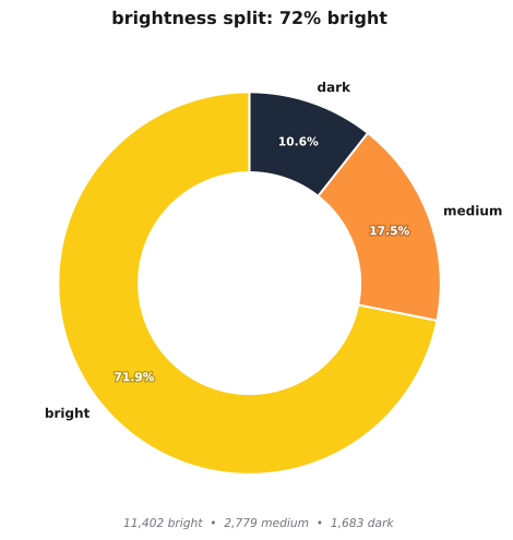
- bright 11,402 icons, 72 percent
- medium 2,779 icons, 18 percent
- dark 1,683 icons, 11 percent
most apps choose bright. dark is rare.
we then checked average weighted rating for each bucket.
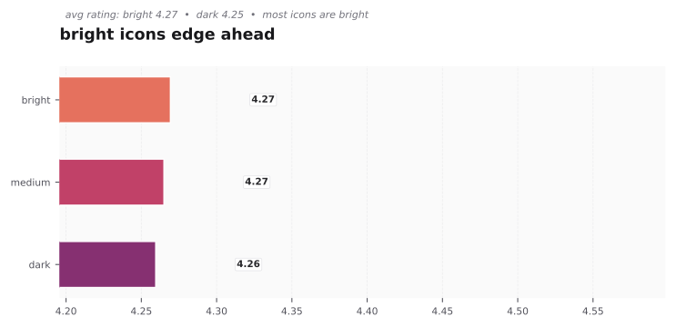
bright is first at 4.269. medium is next at 4.265. dark is last at 4.259. bright is both most common and most liked, even if the gap is small.
why bright wins
bright reads fast at small sizes. it stands out on both light and dark wallpapers. dark icons can sink into the background, especially if the glyph is also dark.
when dark still works
dark can feel premium and focused. entertainment apps use black at 11 percent, which is double the store average of 5.6 percent. if your brand is about cinema, music, or pro tools, dark fits. just keep the center glyph bright and add a thin light border so the shape stays clear.
quick check for your icon
view it at 60px and at 20px on a dark background. if the shape blurs, lift luminance a little or add a light edge. if it still reads well, you are good.