we looked at 15,864 real app icons and checked their dominant color.
the result is simple. most apps play it safe.
what we found
white is first with 4,693 icons, that is 29.5 percent. blue is second with 3,708 icons, that is 23.4 percent. together they are more than half the store.
red is next with 1,590. orange with 1,158. green with 1,105. the rest are smaller. gray is last with only 244.
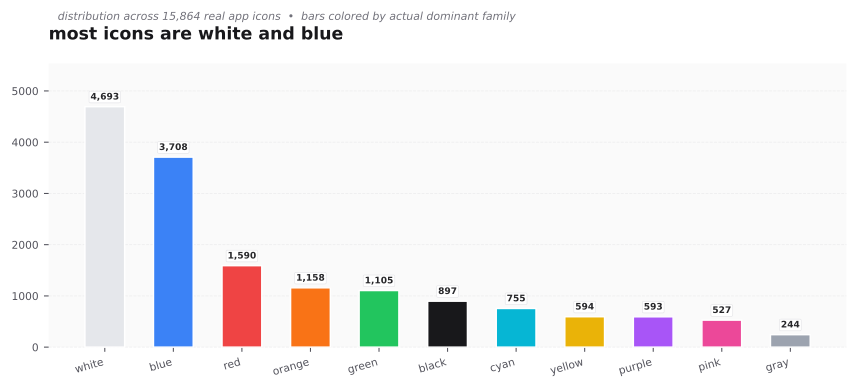
this tells us what users expect to see. a white or blue icon feels familiar and clean. it does not surprise anyone.
the surprise in ratings
we then grouped the same icons by color and took the average weighted rating. weighted rating is a fair average that adjusts for how many ratings an app has.
the order changes.
- purple 4.28
- green 4.28
- red 4.28
- black 4.27
- white 4.25
- gray 4.23, the lowest
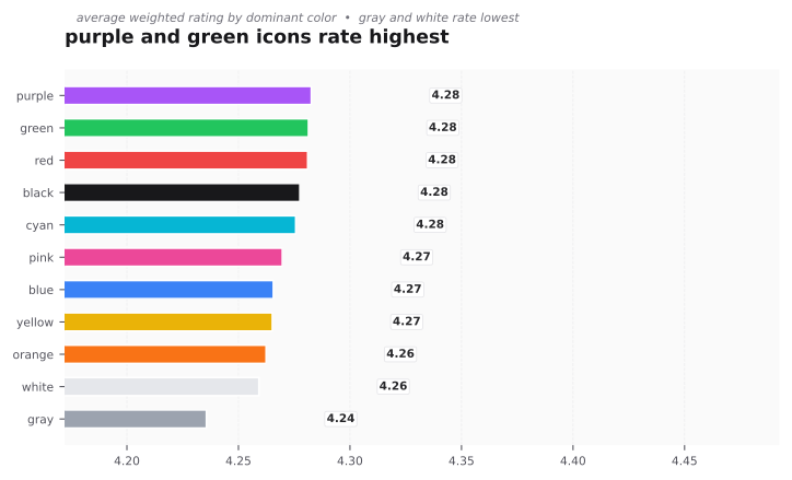
gray looks minimal and safe, but it rates worst. white is the most used but rates near the bottom. purple is used by only 3.7 percent of icons, yet it rates at the top.
why this happens
familiar colors are easy to trust, but they are also easy to ignore. when many apps use the same color, no single app stands out. rare colors get attention. if they are done well, people remember them and rate them higher.
what you can do
- if you want to feel safe and native, use white and blue. your icon will blend in.
- if you want to stand out and still rate well, try purple or red as dominant, with a clean supporting color. keep the palette tight.
- if you love gray, do not use it alone. add a strong accent like yellow or cyan so the icon does not look dull.
try it in iconhub. filter by dominant color on the home page and open similar colors to see how top rated icons in that family balance contrast and white space.