every genre has a color it leans on. users learn that look. a finance app that is blue and white feels right at a glance. a food app that is red feels tasty.
what we checked
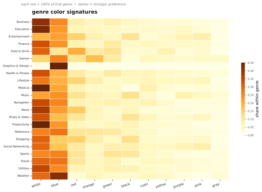
we built a heatmap from 15,864 icons. rows are genres, columns are dominant colors, each cell is the share within that genre. white is the base everywhere, then each genre adds its accent.
clear signatures
- business 40 percent white, 25 percent blue
- education 43 percent white, 23 percent blue
- finance 33 percent white, 23 percent blue, 9 percent green
- food and drink 30 percent white, 20 percent red, 11 percent green, 7 percent yellow
- entertainment 19 percent white, 22 percent blue, 14 percent red, 11 percent black
- shopping white and red with black accents
how to read this
darker cell means higher share in that row. each row is 100 percent of its genre. look across your row to see your norm. look down a column to see which genres own a color.
how genres differ on more than color
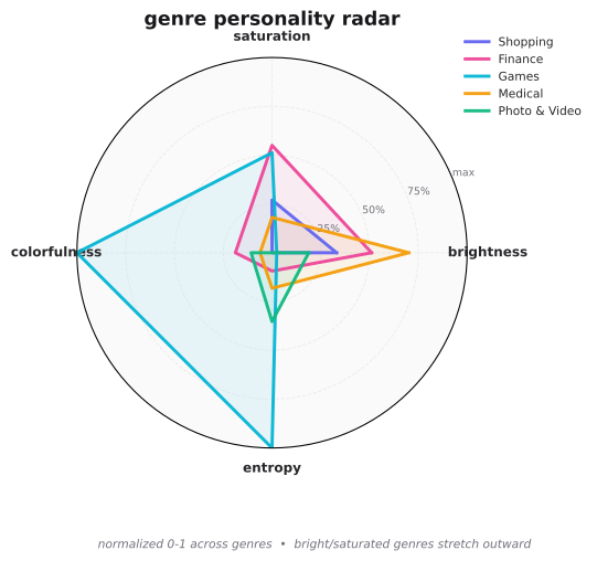
the radar below shows four traits at once, all normalized to 0 to 1 across genres. brightness, saturation, colorfulness, and entropy. entertainment stretches wide, medical stays tight.
what you can do
- want to fit in, match the signature. a blue and white finance icon will feel instant and safe.
- want to stand out, pick the gap. finance has only 4 percent purple. purple also rates top globally, so a purple finance icon will pop and still test well.
- open any icon in iconhub and check similar colors. see how top brands in your genre use the accent without clashing.