saturation is how strong and pure a color feels. we averaged it for each genre to see who goes vivid and who stays calm.
what we found
most saturated
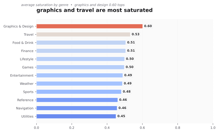
- graphics and design 0.60
- travel 0.53
- food and drink 0.50
- finance 0.50
least saturated
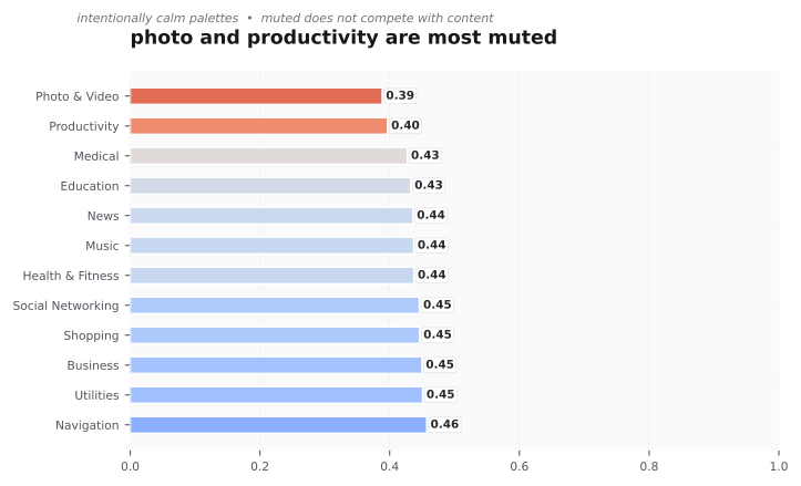
- photo and video 0.38
- productivity 0.39
- medical 0.42
- education 0.43
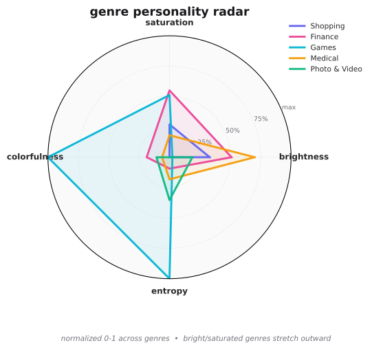
the full shape by genre
the radar shows brightness, saturation, colorfulness and entropy together, normalized to 0 to 1. you can see how travel pushes out and photo and video stays small.
why this makes sense
graphics and design must show it can handle color, so it goes vivid. photo and video stays muted on purpose, the app should not compete with the photos inside it. productivity is also muted for calm and focus. these choices match the job of the app.
what you can do
- if you design for a vivid genre, you can be muted to stand out, but do it with intent. add one vivid accent so the icon does not look washed next to neighbors.
- if you design for a muted genre, keep the palette tight. one dominant plus one support color reads better than many hues.