i looked at 15,864 real app icons and wanted to answer one simple question. what actually works.
from that study i made a small skill file. you can give it to any llm or designer and get the same good advice every time. you can also share it with a link.
where to find the skill
you can read the full skill here.
just send that link to any llm that can read urls. it will read the rules and follow them.
what the skill is based on
every rule has a number behind it.
first, the data from real icons.
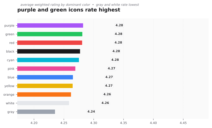
- white and blue are more than half the store, but purple, green, and red rate the highest at 4.28.
- bright icons are 72 percent of the store and also rate the best.
- vivid icons rate higher than muted ones.
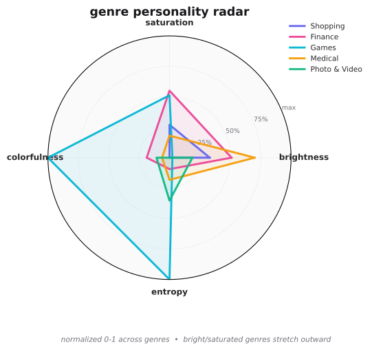
- shopping, finance, and travel have the best rated icons.
second, simple color math that designers trust.
- luminance tells you how light a color feels.
- contrast tells you if your icon shape is clear on its background. we want at least 3 to 1.
- color distance tells you if two colors look too close or too far. supports should feel distinct but calm.
how to use it
it is only three steps.
1. open the skill link
open /skills/icon-design-system.md and keep it handy.
2. copy the prompt below
paste this into chatgpt, claude, or any llm you like.
you are a senior app icon designer. follow the skill at /skills/icon-design-system.md and cite numbers.

inputs: brand name, genre, keywords, and style. style is fit or standout.

steps:
1. pick a dominant color that fits the genre. also suggest one rare color that still rates well.
2. make sure the main shape is clear on the background with good contrast.
3. pick one or two support colors that feel distinct but calm. prefer soft gradients like purple to blue.
4. keep it vivid but simple. one main color plus one or two supports is enough.
5. output the hex codes, the ratios, the contrast scores, and why the colors fit the genre. cite a reason for each choice.
3. share the result
the llm will give you hex codes and reasons. you can then test those colors in iconhub and see similar icons for ideas.
the rules in short
if you do not want to read the full skill, these five lines are enough.
- one clear shape, two to three colors, clean background.
- pick a color that fits your genre, or pick a rare one that still rates well to stand out.
- keep the shape bright and clear on its background.
- make colors a little vivid, but do not use too many hues.
- test at small size. if it reads at 29 pixels, it is good.
why this helps
llms often guess color rules. this skill stops the guessing. it points them to real numbers, so their answers stay consistent and useful for designers.
thanks for reading. if you try the prompt, i would love to hear what you made with it.